Work / Brand Identity
KOLIHO
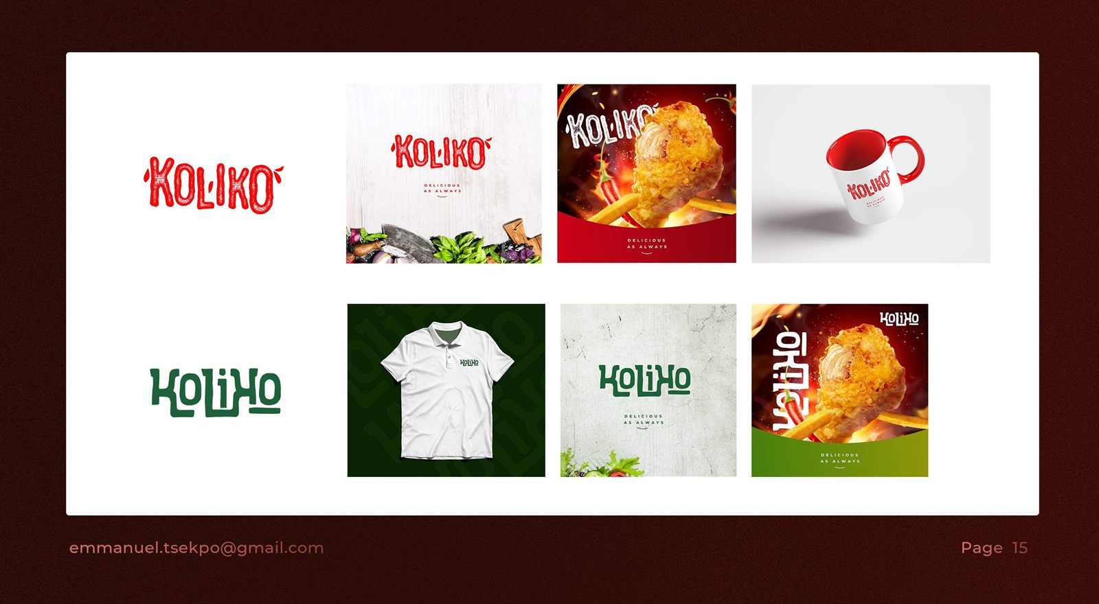
A hand-lettered identity for a food brand. The tagline is delicious as always. The wordmark has an uneven baseline and a splash detail. It runs in red and in green, so the brand can sit on both indulgent and lighter menus.
Brief Summary
A hand-lettered identity for a food brand, tagline delicious as always: custom lettering with an uneven baseline, thick-to-thin strokes, and a splash on the "K", built to hold up over busy food photography.
Strategic Approach
- Red: the primary look, used on fried and grilled items.
- Green: used for salads, sides, and lighter menus.
Impact
The two-colourway system now runs across packaging, a polo and mug, a concrete-wall brand shot, and social posts that pair the mark with close food photography and the "delicious as always" lock-up — letting KOLIHO's menu split cleanly between indulgent and lighter items without losing one brand voice.