Work / UI / UX
Volta Pay
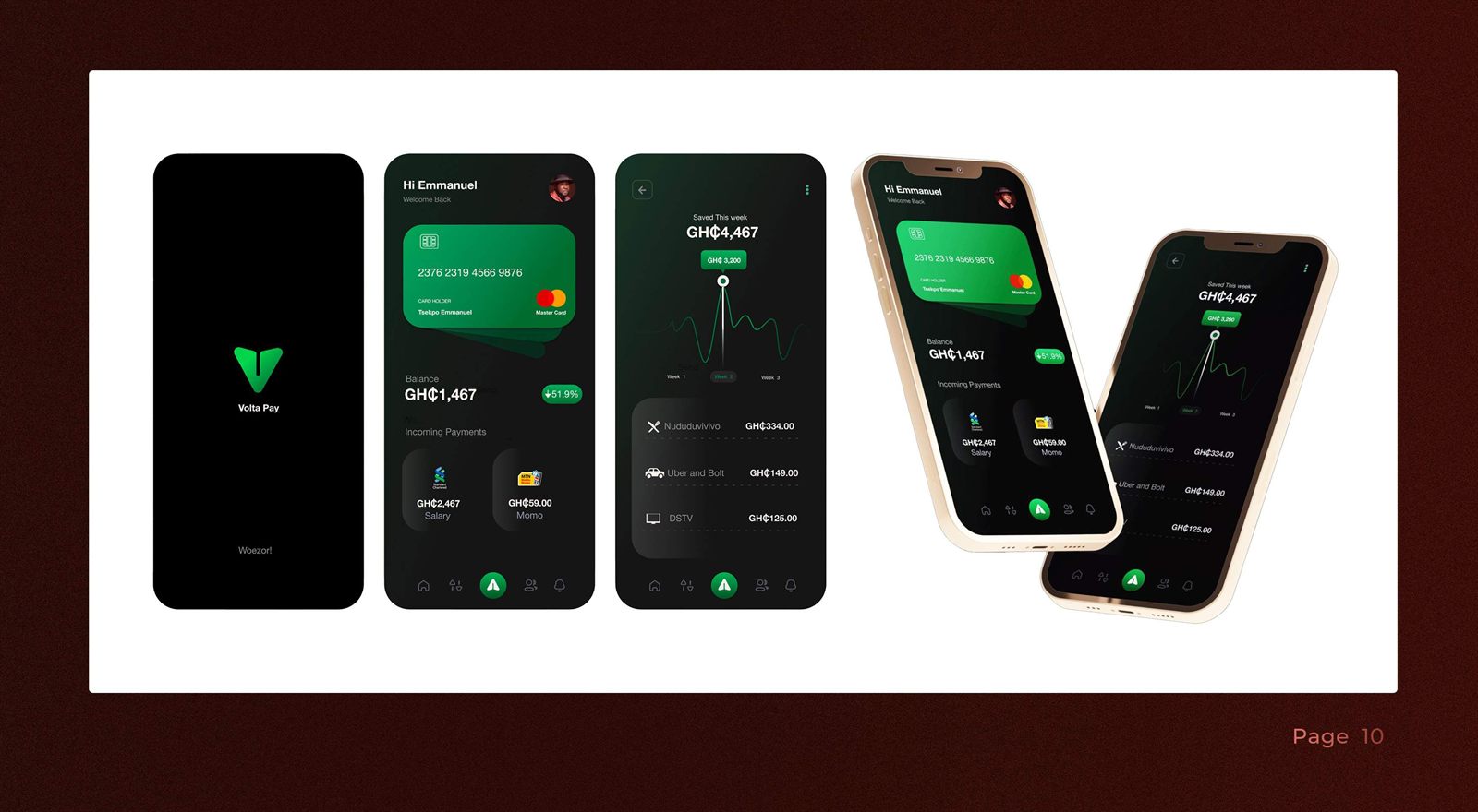
A concept for a Ghanaian payments app: dark and legible. It opens on "Woezor!", then puts three things in reach: your balance, what's coming in, and what you saved this week.
Brief Summary
Many local wallet apps are busy. Volta Pay uses a near-black background, one accent green, wide spacing, and a card component styled like a physical card. Amounts are in cedis (GH¢). Incoming payments use names people recognise: salary, MoMo, Standard Chartered.
Strategic Approach
- Splash: the mark, a warm "Woezor!" welcome.
- Home: virtual card, balance with trend, incoming payments, quick actions.
- Saved this week: a single-number headline over a calm line chart, with the week's outflows below.
8-pt spacing, one type family, and limited motion: cards settle, numbers count up once.
Impact
As a concept, Volta Pay shows a calmer alternative to the area's busier wallet apps. The system extends cleanly to send and request, bills, and a savings goal, ready to hand to an engineering team.